Background
About the Company
Priority Software is a leading ERP platform used by over 75,000 organizations worldwide. It provides businesses with a full suite of management tools for operations, finance, logistics, and more.
My role
As the lead product designer, I owned the end-to-end redesign process - from user research and ideation to prototyping and usability testing.

We expanded our research to include other products in the ecosystem - from direct competitors like Monday and Azure to experience-driven platforms such as Wix and Apple. These insights helped us identify opportunities to modernize the experience and align it with today’s user expectations. We sketched new layouts that made workflows transparent and intuitive, reducing clutter and focusing on logical hierarchy.
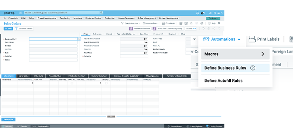
The list
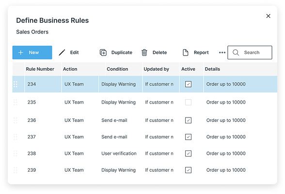
We creates new list with actions in updated button, we changed the place and add important data to the list.
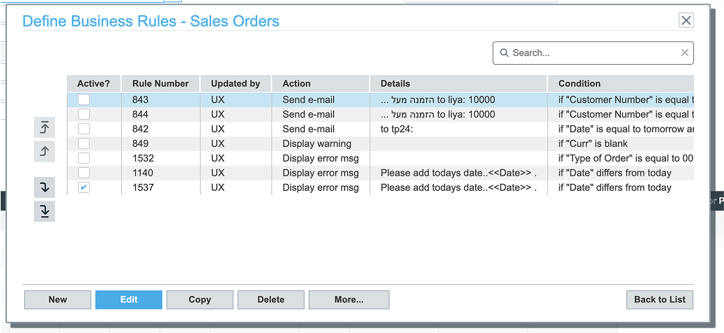
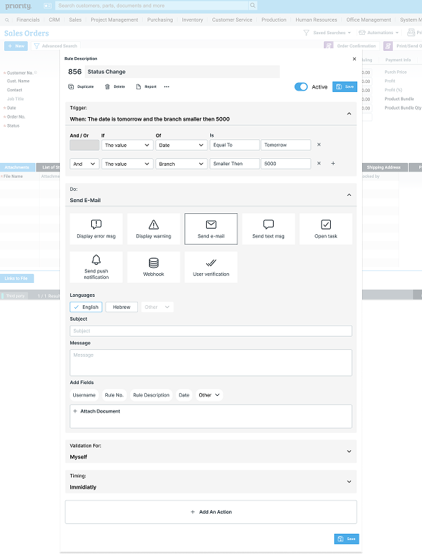
The rule
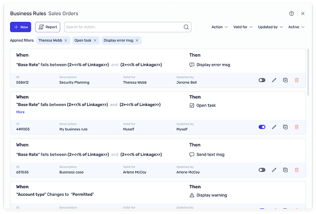
The list - phase 2
We redesigned the rules list into a card-based layout, displaying more key information at first glance. Irrelevant actions were removed, and rule-specific actions were added directly to each card for quicker access and a cleaner experience.
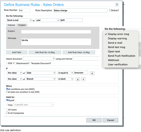
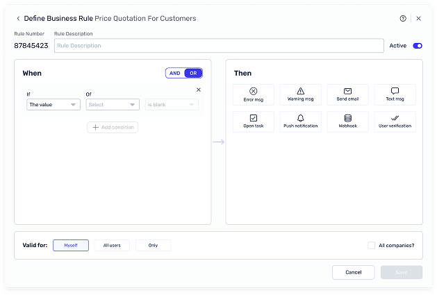
The rule - phase 2
The rule creation process was redesigned to improve clarity and efficiency. We shifted from a collapsible, vertical layout to a side-by-side format, allowing users to view and edit conditions and actions simultaneously. Additionally, we introduced refined microcopy throughout the flow to make the process clearer, more intuitive, and aligned with users’ terminology.
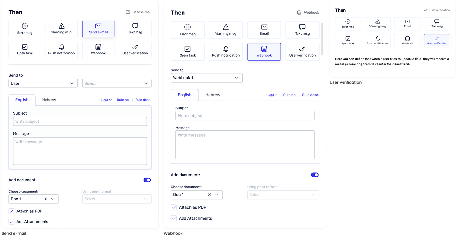
Actions
Stage 4: Test
Summarise
This short video, created with the marketing team, showcases the new AI-powered feature introduced in the latest version. It helps users create rules faster and more intelligently by suggesting relevant actions and automations based on their input.