Stage 1: Empathize
The existing automation feature was built over a decade ago and suffered from poor usability, unclear logic, and outdated visuals.
We conducted interviews with users from various industries – including manufacturing, healthcare, and education – to identify key pain points.
- Confusing flow between conditions and actions
- No support for multiple recipients or flexible rule logic
- Outdated design and unclear visual hierarchy
- Hard-to-scan lists with missing key information
These findings shaped our goal: to redesign the tool for clarity, efficiency, and modern usability.
Stage 2: Define
Persona: Maya, the system administrator

Maya Patel
“Why work hard if a machine can do it?”
Name: Maya Patel
Role: Priority System Administrator
Company: FreshNest Foods
Age: 30
Experience: 5 years in Implementation and Integration of Priority in the Organization
Personality Traits: Curious, Methodical, Tech-savvy, Results-oriented, Collaborative.
Maya Patel, a Priority System Administrator at FreshNest Foods – A national food distributor using Priority to manage inventory and streamline orders. She is responsible for tracking inventory, monitoring shipment statuses, and ensuring smooth operations.
She’s tech-savvy, analytical, and thrives on efficiency – yet spends hours manually updating data across multiple systems. With scattered information and limited real-time visibility, she struggles to make fast, confident decisions.
Maya needs automation that simplifies repetitive work and delivers accurate, actionable insights.
Stage 3: Ideate
To ideate this we first research the current tool and what is the function, how it works and what users like in this tool.
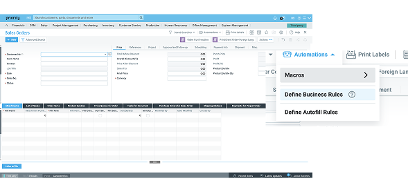
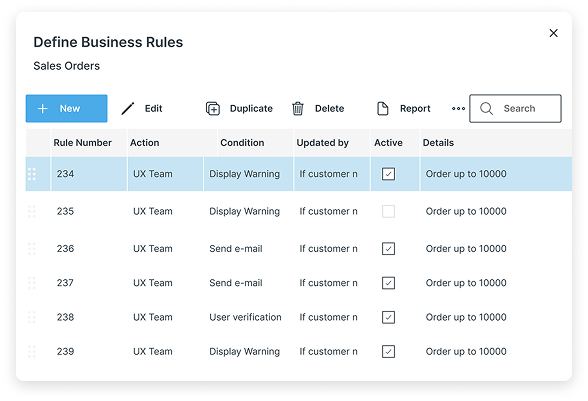
in the standard priority screen the user can see here data and do some actions, to open the automation tool he need to press on the robot icon and see that menu.
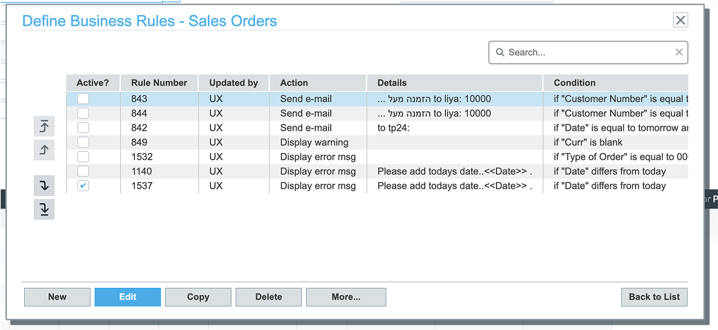
Press on the “define Business Rules” will open the list of exist rules (if we have rules for this screen)
To creat new or edit the user need to press on the buttons in the bottom of this screen.
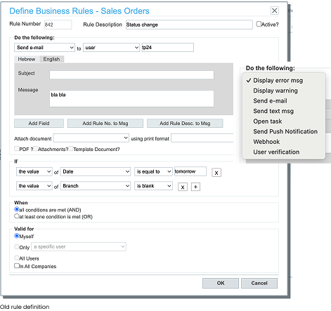
Define rule look like this, the options for actions open in this drop down.
After researching the existing tool, we realized that it had been developed many years ago and no longer met modern usability standards. It felt outdated, unpleasant to use, and included several unclear or confusing elements. Additionally, it was missing key features that had become standard among competitors.
Stage 4: Prototype
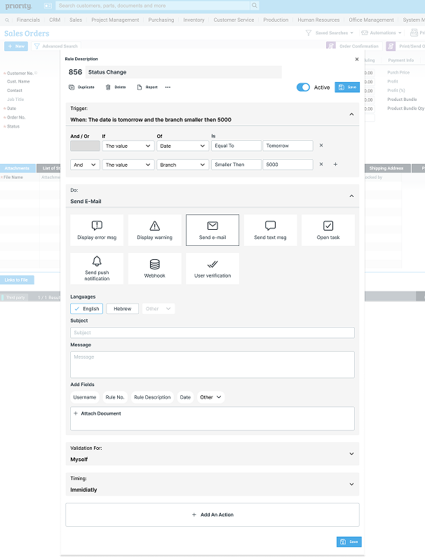
When we began evaluating the existing system, it quickly became clear that it felt outdated and lacked the functionality users expected. The flow between actions and conditions was inconsistent – in some areas, actions came first, while in others, conditions did. This inconsistency made the experience confusing and hard to follow.
We also discovered that several components, like email, text message, and user verification actions, looked identical even when their states or purposes differed. Users asked for more flexibility – such as adding multiple recipients or combining multiple actions – but due to feasibility constraints, we started by implementing multi-recipient functionality.
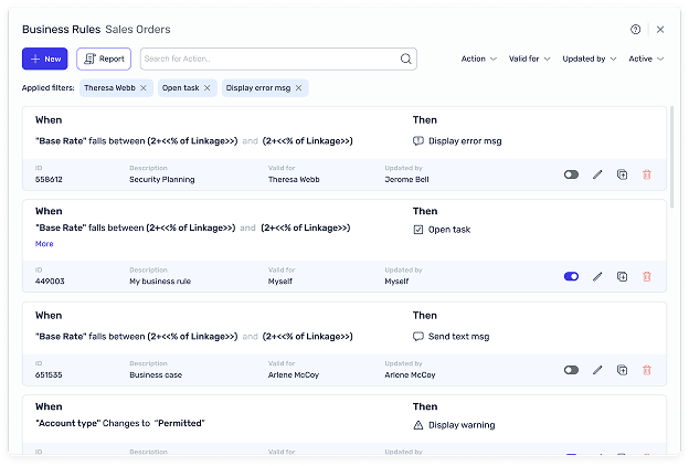
Another major pain point was the rules list itself. Users struggled to find what they needed because important data wasn’t visible, and the side buttons were unclear.
To address these challenges, we began by sketching ideas and building an interactive prototype that reimagined the experience from the ground up.
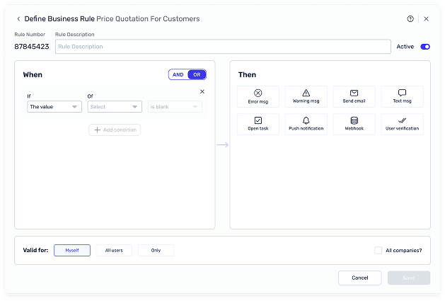
During usability testing, we noticed that users often struggled to understand the rule creation flow and found it difficult to connect conditions with their resulting actions. To address this, we redesigned the process to follow a more intuitive, chronological sequence – if… then… – aligning the layout with how users naturally think through logic.
We also transformed the action list into a set of clear icon buttons, making it easier to scan and select actions quickly.
To improve usability even further, we added a collapse option, allowing users to switch between a detailed view and a summarized version of each rule.
This gave users a clearer overview while maintaining flexibility and control over their workspace.
The first prototype introduced a modernized toolbar and card-based rule list. While users appreciated the refreshed look, feedback highlighted two key issues: excessive scrolling and oversized icons.
Based on this, we redesigned the layout into a side-by-side structure – allowing users to view both conditions and actions at a glance. We added filters, data highlights, and contextual actions directly in the rule card.
Usability testing confirmed the success of these improvements, with users describing the experience as clearer, faster, and easier to navigate.
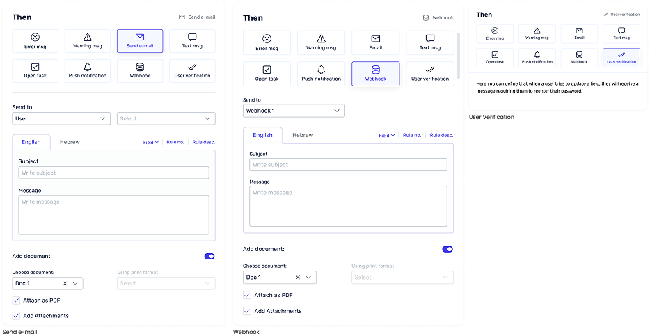
During our research, we discovered that each action in the “Then” section serves a different purpose.
For example, the “Send Email” action includes multiple configuration options, while “User Verification” initially had no functionality.
To create a consistent experience, we designed a dynamic interface where each action’s settings appear only after the action is selected.
After launch, we collected feedback from real users. The overall feedback was overwhelmingly positive – users described the experience as both intuitive and helpful.
We also gathered valuable improvement suggestions, such as increasing spacing in the “of” dropdown and adding data filtering options to the rule list.
This successful redesign not only improved usability but also set a new design standard for future automation tools within Priority. In the latest version, we elevated the feature even further by integrating AI-powered options for clearer, more interactive workflows.
This project was an incredible learning experience that strengthened my understanding of designing for complex systems.
I learned how to bridge the gap between user needs, technical limitations, and business goals – while maintaining a clean and consistent user experience.
I’m proud of how our team transformed a legacy tool into an efficient, modern experience that truly empowers users.